Redesign CORTONYL's Packaging
Liverpool John Moores University
Drawing from the Essay "Impact of User Experience (UX) on Medical Packaging", I wanted to present my research more visually, so I chose to redesign the packaging of a medical product. Through this redesign, I wanted to demonstrate the significant impact UX has on patient treatment.
The Product
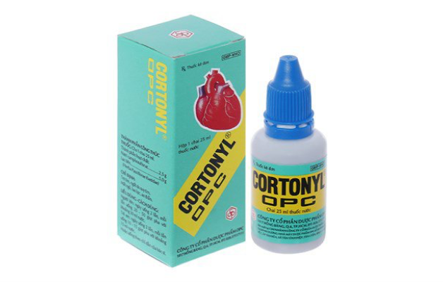
The original packaging of the heart medication CORTONYL requires users to count individual drops to ensure the correct dosage. However, in emergency situations, especially for elderly patients, this method may not be effective or user-friendly. We need a redesign that better accommodates the needs of patients, providing clear and easy-to-administer dosing options in critical moments.
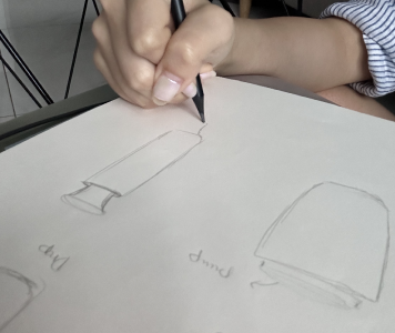
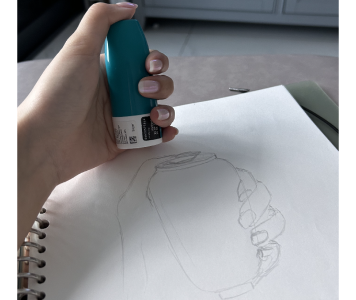
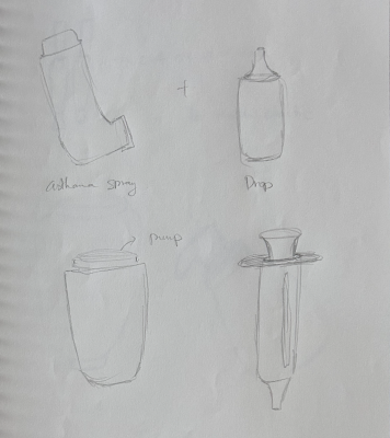
The Process
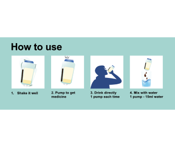
In developing the new packaging for CORTONYL, I drew inspiration from asthma inhalers used during asthma attacks. To address the challenges that elderly patients face in emergency situations, I came up with the idea to design a packaging that has a mechanism similar to that of an asthma inhaler. Instead of counting drops, the patient can simply press on the top of the bottle to dispense the correct dose. The press head is designed with a large cross-section to help elderly patients easily manipulate. This innovative design aims to provide a user-friendly solution and help in times of emergency.
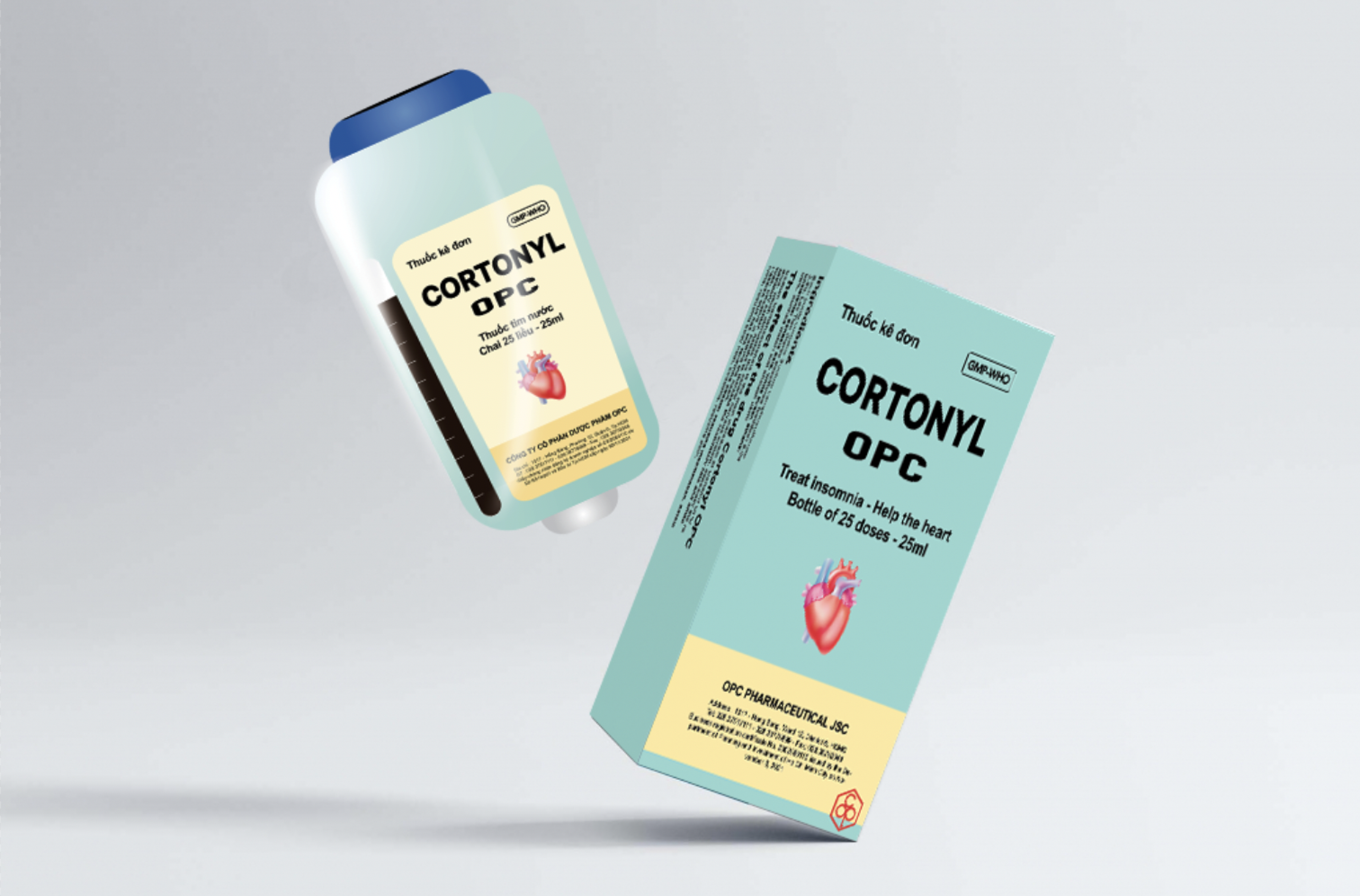
The Packaging
The digital version of the CORTONYL packaging incorporates a user-friendly design. The top part of the bottle functions as a press button, while the body contains essential drug information, and an indicator shows the medicine's quantity. The design is deliberately simple and intuitive, ensuring easy manipulation for patients, especially the elderly. This thoughtful approach aims to enhance the overall user experience, making it hassle-free for patients to access and administer the medication.
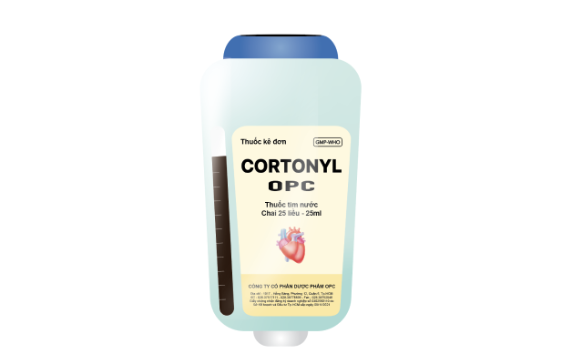
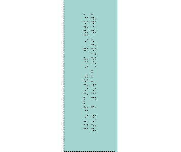
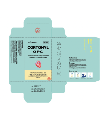
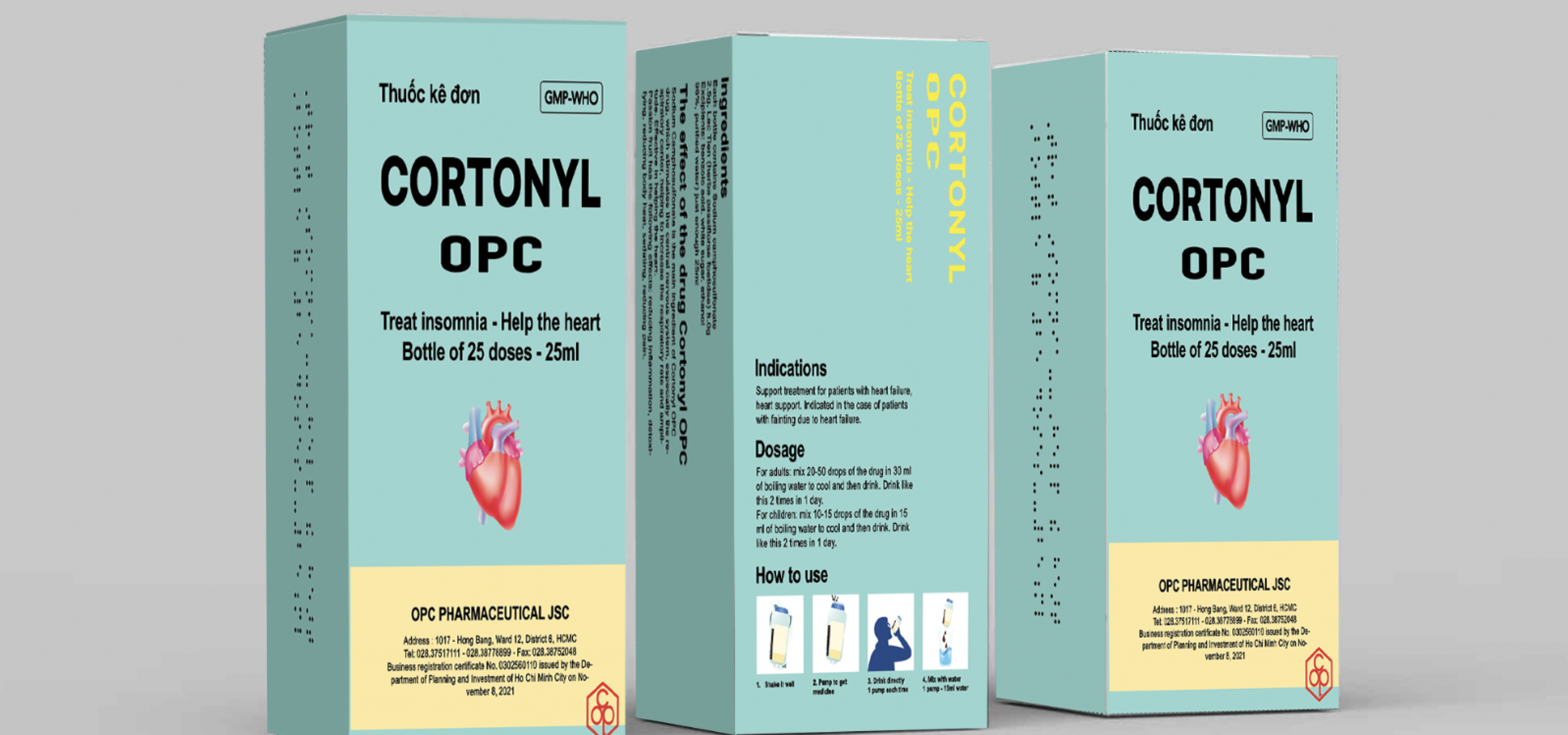
The outer box of the redesigned CORTONYL packaging features a standard paper shell. However, to enhance user-friendliness, the box includes intuitive images and large, clear fonts for easy understanding, particularly for elderly patients. Additionally, the packaging incorporates Braille printing to support blind and visually impaired patients. Vital information, such as the expiration date, is prominently displayed to ensure patients have access to crucial details about the medication. This comprehensive approach caters to diverse patient needs, making the packaging inclusive and user-centric.
The Outcome